Let’s Talk About Logos
When you’re young, things are very black-and-white. Something is either absolutely good or definitively bad.
Then you grow up and realize that nuance exists.
When I was a kid, starting in middle school, having logos on your clothes was absolutely a good thing IF those logos were the “right” logos. Obviously, you had to be wearing the clothes that were considered cool.
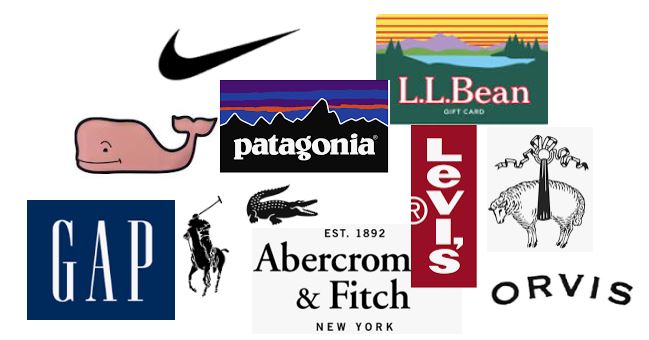
Nikes were cool. Levi’s wide leg jeans were cool. Aeropostale and Abercrombie were cool.
Wearing those logos was not only acceptable, it was critical! Wearing the right logos meant you had enough money to afford nice things and were cool enough to hang out at the mall.
Wearing clothes with no logos whatsoever meant you were poor and were wearing “Brand X” clothing.
As I got older, I reflexively thought wearing logos was definitively bad.
“I’m not going to be a walking billboard!”, I smugly thought, and eschewed logos altogether.
Well, I’m an established adult now and I realize that, as always, there isn’t a clear-cut answer to whether wearing logos is good or bad.
Here are my thoughts on when it’s ok to wear logos and when it’s not.
Logos are symbols and they can communicate very specific things about the wearer. Unfortunately, some logos have bad connotations.
The best example that springs to mind is Monster Energy Drink.

At this point, that logo makes us think of gamers in their mothers’ basements or that one dad with the “Don’t Tread On Me” bumper sticker who argues with the tee-ball coach.
It may not be right. It may not be fair. But that’s how easily our minds fill in the blanks about someone based solely on the logos they choose to wear.
Usually, the safest place to sport logos is within the realm of extreme casualwear. This means that your sweatshirt with “GAP” across the front that you wear on the weekends to run errands is ok. Likewise, your fleece with the little “Patagonia” emblem on the breast (the Patagonia logo has its own set of baggage, at least in NYC, but that’s a discussion for another day).
These are clothing items that are chucked on without much thought. You aren’t trying to impress anyone on your run, so of course the swoosh on your Nike baseball cap is just fine.
Once you move up the niceness scale into clothing you would wear when you actually care about how you look (should be 99% of the time), only a very select few logos make the cut (I realize that this cuts out a huge chunk of streetwear, but I am ok with that, since I think most streetwear looks pretty bad).
Usually, these acceptable logos take the form of logos that have become so iconic that they are hardly separable from the items they adorn.
In our minds, a polo shirt has a little horse-and-rider or an alligator on the left breast. A pair of denim jeans has a little red tag on the back right pocket. A thick pair of black sunglasses says Ray-Ban in the upper left corner. Black and white canvas sneakers have a white circle with a blue star in the middle.
These are all instances where the brand and the item are so closely associated that you can hardly separate them. These logos are ok to wear since our eyes almost gloss over them. They don’t stand out very much.
But outside of those, and others like it, it’s generally smart to steer clear of logos since they don’t actually add anything to your appearance (and often detract from it).
This means no to the Vineyard Vines whale or the Brooks Brothers sheep on the pockets of your gingham shirts you wear to the office.
Those Banana Republic chinos with the stamp right above the back pocket? Also, not a great look.
The item itself should look good without an assist from the brand association.
I should make a distinction here that logos are very different from designs. You can wear an item and have it be instantly recognizable as belonging to a certain brand based solely on how it looks versus the existence of any sort of logo.
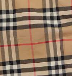
Examples of these are Burberry plaid…
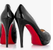
…the red bottoms of Louboutin shoes…
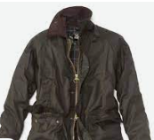
…the waxed cotton/corduroy collar combination of Barbour…
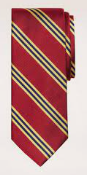
…or the Brooks Brothers “#1 stripe” pattern.
These design elements serve basically the same function as a logo from the brand’s perspective, but in a more authentic way. A logo is a bratty high-schooler. An instantly recognizable design is an adult with a mortgage and two kids.
Now, you can still be garish or unstylish while sporting those iconic designs. I’m not saying wearing a Burberry trench is an instant signifier of good taste. Personally, if you were to look at the vast majority of my wardrobe, you wouldn’t be able to tell where I bought any of it.
My point is that, for the most part, you would do well to eschew logos, as they don’t add anything to your appearance other than signaling your affinity for a certain company.
I really think it comes down to proportion and moderation, which can be said of anything having to do with clothes. If the logo is small and unobtrusive and doesn’t distract the eye, then it’s most likely fine (in most circumstances). Also, if there is one logo present on your person, rather than five, that’s also probably fine. A bunch of logos all over you makes you look like a NASCAR driver.
The argument that you aren’t supposed to be a walking billboard holds water.
If you’re not getting paid by the company to wear their products, then why do it?